Alerts
Alerts are the important messages that are used to grab the user's attention without interrupting the user flow.
Primary alert
This is a primary alert.
Info alert
This is an info message.
Success alert
This is a success message.
Warning alert
This is a warning message.
Error alert
This is a error message.
Alert with close button
This is a primary alert.
Avatars
Avatar is a circle that represents a user. Typically used with a user's profile image.
Image Avatars

Avatars in different sizes


Fallback Avatar
Badges
Badges can be used for an additional marker for avatar, card or any other component.
Badge on Icon
1
Badge on Avatars
        4


        7
4
7
Text Badge
NEW
Popular
NEW
Buttons
Buttons are also called as call to action. We have range of buttons . You need to add respective classes, and you are good to go.
Solid Buttons
Outlined Buttons
Link Buttons
Icon Buttons
Floating Buttons
Disabled Buttons
Cards
A card is a sheet used to represent the information related to each other like product details.
Card with badge
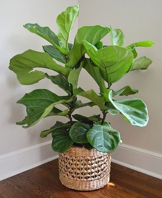
Fiddle Leaf Fig Plant
Rs. 550
            NEW


                Fiddle Leaf Fig Plant
                Stock available

                    Rs. 550
Card with dismiss
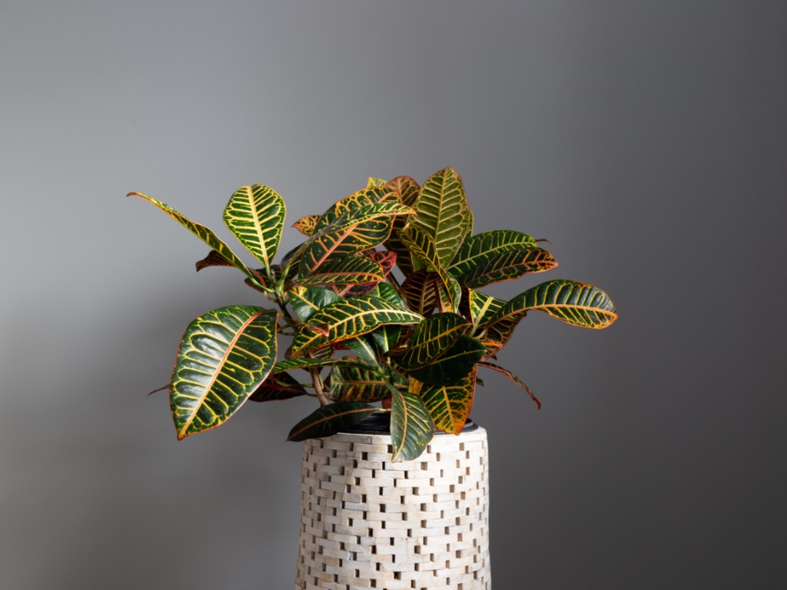
Croton Plant
Rs. 499
Neque porro quisquam est qui adipisci velit...
Croton Plant
Stock available
Rs. 499
Neque porro quisquam est qui adipisci velit...
Card with text overlay
Sold Out!
Croton Plant
Rs. 499
Neque porro quisquam est qui adipisci velit...
Sold Out!
Croton Plant
Stock available
Rs. 499
Neque porro quisquam est qui adipisci velit...
Text only Card
Croton Plant
Lorem ipsum dolor sit amet, consectetur adipiscing elit. Sed faucibus diam vitae erat ullamcorper elementum. Donec et ante porta, euismod turpis vitae, tincidunt elit.
Croton Plant
Lorem ipsum dolor sit amet, consectetur
adipiscing elit. Sed faucibus diam vitae erat ullamcorper elementum.
Donec et ante porta, euismod turpis vitae, tincidunt elit.
Vertical Card
Croton Plant
Rs. 499
Neque porro quisquam est qui adipisci velit...
Croton Plant
Stock available
Rs. 499
Neque porro quisquam est qui adipisci velit...
Horizontal Card
Croton Plant
Rs. 499
Neque porro quisquam est qui dolorem ipsum quia dolor sit amet, adipisci velit...
NEW
Croton Plant
Stock available
Rs. 499
Neque porro quisquam est qui dolorem ipsum quia
dolor sit amet, adipisci velit...
Images
Images can be responsive to fit the parent's width, and also can be customised to be round shaped.
Responsive Image

Round Image
Input Component
Examples of Textbox, Textbox with error styling, and form is given below.
Textbox
Textbox with error styling
Not valid
Input with Icon
Form Example
Typography
Example of Heading Text
For heading you can use h1, h2, h3, h4, h5, h6 elements.
    This is h1 heading.
    This is h2 heading.
    This is h3 heading.
    This is h4 heading.
    This is h5 heading.
    This is h6 heading.
This is h1 heading.
This is h2 heading.
This is h3 heading.
This is h4 heading.
This is h5 heading.
This is h6 heading.
Example of Paragraph Text
Paragraph text is avaliable in differnt sizes. You have to add the appropriate classes to the p tag or the wrapper element.
    Extra large text size.
    Large text size.
    Medium text size.
    Small text size.
    Extra small text size.
Extra large text size.
Large text size.
Medium text size.
Small text size.
Extra small text size.
Example of Text Alignment.
For text alingment you can add the following classes to the wrapper element.
    Text is aligned to left.
    Text is aligned to center.
    Text is aligned to right.
Text is aligned to left.
Text is aligned to center.
Text is aligned to right.
Some Extra text utilities.
There are some extra text utilities mentioned below. You have to add the corresponding classes to the wrapper element to use them.
        Bold weight text
        Regular weight text
        Light weight text
        Text with Primary color
        Text with Secondary color
        Text Strike through
        Text underlined
Bold weight text
Regular weight text
Light weight text
Text with Primary color
Text with Secondary color
Text Strike through
Text underlined
Lists
Example of Unordered list
- List item 1
- List item 2
- List item 3
- List item 1
- List item 2
- List item 3
- List item 1
- List item 2
- List item 3
- List item 1
- List item 2
- List item 3
- List item 1
- List item 2
- List item 3
- List item 1
- List item 2
- List item 3
Example of Ordered list
- List item 1
- List item 2
- List item 3
- List item 1
- List item 2
- List item 3
- List item 1
- List item 2
- List item 3
- List item 1
- List item 2
- List item 3
- List item 1
- List item 2
- List item 3
- List item 1
- List item 2
- List item 3
- List item 1
- List item 2
- List item 3
- List item 1
- List item 2
- List item 3
- List item 1
- List item 2
- List item 3
- List item 1
- List item 2
- List item 3
- List item 1
- List item 2
- List item 3
- List item 1
- List item 2
- List item 3
List with no styling
- List item 1
- List item 2
- List item 3
- List item 1
- List item 2
- List item 3
Stacked List
This is an unordered list without bullets. We can add desired component inside the li element.
-
Stacked Notification
-
Stacked Notification
-
Stacked Notification
-
Stacked Notification
-
Stacked Notification
-
Stacked Notification
Modal
A modal is a dialog box or a popup window that is displayed on top of the current page.
Modal Component
This is a Demo Modal.
Lorem ipsum dolor sit amet, consectetur adipiscing elit, sed do eiusmod tempor incididunt ut labore et dolore magna aliqua. Ut enim ad minim veniam, quis nostrud exercitation ex ea commodo consequat.
This is a Demo Modal.
Lorem ipsum dolor sit amet, consectetur adipiscing elit, sed do eiusmod tempor incididunt ut labore et dolore magna aliqua. Ut enim ad minim veniam, quis nostrud exercitation ex ea commodo consequat.
Live Demo
Click on below open modal button to open the modal.To close the pop-up, click on close icon or Back button.
Rating
Rating components can be used as read-only badge and can be used in reviews section as form too.
Rating Components
Toast
Toasts provide brief feedback about an operation through a message. Toasts contain a single line of text directly related to the operation performed.
Simple Toasts
        Saved successfully!
        Try Again Later!
        Info Toast
Toast with close button
Can't send photo.
Can't send photo.
Live Demo
Click on below open toast button to open a toast.It will disappear after 5 seconds.
Added to Bag.
Added to Bag.
Simplified Grid
CSS grid creates complex responsive web design grid layouts more easily and consistently across browsers.
Two Column Grid
                grid item 1


                grid item 2
Two Row Grid
                grid item 1


                grid item 2
Three Column Grid
                grid item 1


                grid item 2


                grid item 3
Three Row Grid
                grid item 1


                grid item 2


                grid item 3
Slider
Sliders are used to decide range for something like sound in videos, price in shopping sites, etc.
Styled Slider
Default Slider with Icon